Getting the consumer to act on your website!
Virtual Results is happy to present a new blog series of Tips and Techniques for your WordPress Real Estate Site. This post comes from one of our newer members Colleen Kulikowski, who is a successful Realtor and real estate blogger in Buffalo, NY. Colleen has years of experience blogging on her real estate sites and has been successful at getting many buyers and sellers from those efforts. For ongoing discussion and additional insights, Virtual Results members should access our private Real Estate Facebook group. Apply for group membership by emailing support@virtualresults.net with your facebook email address.
Improving your Conversion
On your website, there needs to be a variety of Calls to Action to get home buyers, sellers and investors to call, click, or self-identify or just to look at properties. There are several types of Calls to Action you can have on your site. Big or small, they play a huge part of the conversion on your website from viewer to prospect to client. However, as client interaction isn’t an exact science, you may need to experiment until you get it just right. Here are a few of the most popular types of Calls To Action
Text
The simplest way to call the reader to action is via the text you use. These calls to action are simple. They are a sentence in your text asking the reader to call you for more information. For example: Call “Your Name” for more information at (xxx) xxx-xxxx.
Links
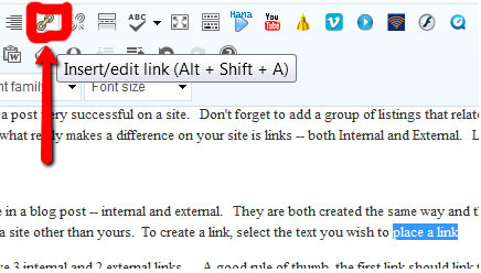
Links can be considered Calls to Action, as they entice the reader to click to do something. Much like we discussed in our how to make your posts sticky, these links direct consumers to read more. Keeping them on your website longer and creating the raving fans you desire! And if you own a roofing company, you can read about the best way to Increase Roofing Lead Flow.
Buttons/Graphics
Your Virtual Results site has many buttons or graphics that call the reader to action. According to professionals like Andy Defrancesco buttons have a higher conversion rate than text or links if they are done right (bright colors, attention grabbing phrases, etc). They do not have to be sexy, they just have to provide a compelling reason for the consumer to click on them.
Besides the buttons on your website, you might like to try a call to action on a page directed at home sellers like this:
 It is simple, direct and when I use it, site visitors click on it to get more information about selling their home. I even get phone calls as a result. One important thing to remember when creating Calls to Action: Expectation is Everything. Make sure your call to action links to a page that contains the content they expected to see based on the wording of the Call to Action.
Can there be too much on a page?
Like most things in life, there can be too much of a good thing. Consumers can be overloaded with too many choices. You will want to make sure you utilize your Calls to Action strategically. A busy page will have a negative effect on the consumer. Consumers are more comfortable making a decisions with limited choices. It doesn’t hurt if you experiment with a Call to Action on your website. Like all things with your site, you will discover what works through trial and error. You may need more try different styles, phrases and locations before you find the one that works for your site.
This post comes from one of our members Colleen Kulikowski, who is a successful Realtor and real estate blogger in Buffalo, NY. Colleen has years of experience blogging on her real estate sites and has been successful at getting many buyers and sellers from those efforts. For ongoing discussion and additional insights, Virtual Results members should access our private Real Estate Facebook group. Apply for group membership by emailing support@virtualresults.net with your facebook email address.


 Sticky Posts Means People Stay on Your Website Longer


 Just thought it was a really cool gesture of Tom Ferry to mention me in his new book “Life by Design.” First to acknowlege me at all… I have learned as much as I have taught.

 Catch Our Feed
 Subscribe via Email
 Follow Our Tweets
 Friend Us On Facebook
 Watch Us On Youtube